Happy House
By: Debra Spark
Photography: Sarah Szwajkos
At first, the woman who commissioned this contemporary farmhouse in Camden had only a general idea of her hopes for her house. She was pregnant, so she knew she wanted a good family place, something that would work for a child from infancy on. She wanted three bedrooms, a great room, lots of light, and lots of windows. She didn’t need a showplace, but rooms in which she and her child could really live. Stylistically, she was more adrift, until she sat down with Phi Home Designs in Rockport. As she looked at classic New England stylebooks, magazines, and websites, her ideas became more refined. She wanted to be in a “bright and lively” environment, she says, and certain colors and views spoke to that desire. “I wanted to feel good in both seasons. To have a fresh and alive feeling in summer, and then when it’s dark in the winter, to close the drapes and still have good color inside.”
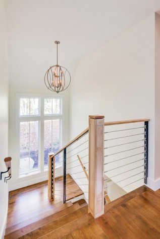
Phi Home Designs is a design/build firm where efforts are always collaborative. Still, Chris Grotton became the lead designer on this project because he has children, which helped him envision the basic layout. The downstairs public spaces are open-plan with an adjacent formal entry, owner’s bedroom, powder room, garage/mudroom entry, and laundry room. A flight of stairs specifically designed to be safe for crawlers leads to a second-floor landing thatserves as a loft space, with a glass balcony wall that shields some sound while allowing one to look out over the entire public space of the ground floor.
At the moment, the loft space is a bright playroom with a tiny slide. Two bedrooms are adjacent. One is a baby room with oversized stuffed animals and cloud wallpaper that covers even the ceiling. A second serves as a “for the time being” owner’s bedroom. When the child grows old enough not to need his mother in the middle of the night, she will use the downstairs owner’s bedroom. The growing child can then take the bigger bedroom, and the loft can turn into an intimately scaled den, tucked under the house’s gable but still sunny thanks to the sloping ceiling skylights, the window apertures of which are flared so as to spread light throughout the room.
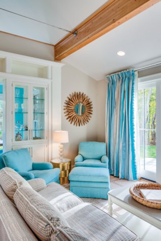
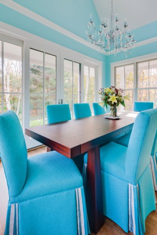
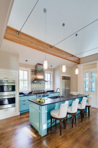
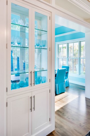
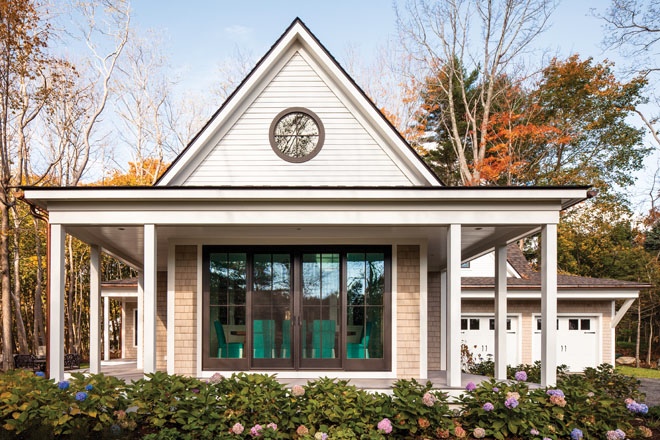
Guests enter the house through a formal foyer and can choose to go straight ahead through a glass door to the backyard and turn to the right, where lower ceilings indicate the private area of the house, or go to the left, where the high-ceilinged great room encompasses the kitchen, living room, and dining room. Two interior wood beams define the central space while providing a natural contrast to rooms that are otherwise striking for their white walls and vibrant turquoise, a color that is used for the kitchen island, silk draperies, and select furniture. Stainless- steel cable rails, which are actually functional collar ties, run perpendicular to the wood beams and provide structural support without impeding the views. To keep the spaces open without feeling cavernous, a partial wall bracketed by glass china cabinets separates the dining room and living room. The dining room itself is cozy, just big enough for table and chairs, but invitingly open to nature, surrounded by three walls of oversized glass windows and sliding glass doors. A large round window under the gable ceiling lets even more light into the high room. It references a round window by the opening foyer and other circles in the interior design, including two living-room pieces: a round side table and a mirror with wood ovals radiating from the center. The dining room has a certain formality, given its large oval glass chandelier and upholstered dining chairs, which the interior designer, Marcy van der Kieft of Margo Moore Interiors in Camden, finished with vivid turquoise and kick pleats of fabric from the living room drapery. The table—a mahogany piece with flared chunky legs—was custom-designed by Phi.
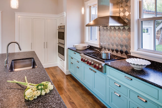
The homeowner is a chef, but she didn’t want her kitchen to be overly commercial looking. The idea was to allow for plenty of storage in lower cabinets, a wall pantry, and the kitchen island, but to place windows where upper cabinetry might otherwise be. Phi had recommended a woven metal backsplash for behind the stove, and this fit with the decision to let the thin metal cabinet pulls on the pantry wall and glass cabinets reference the handle of the refrigerator.
The turquoise kitchen island was inspired by an image that the homeowner saw online and came back to again and again. “I want to feel like that,” she said of the mood the piece put her in. Above the island there are pendant lights whose cables echo the structural cables in the great room. Smaller versions of the same lights hang at the kitchen windows.
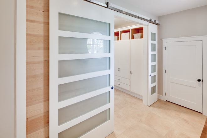
The house is full of unexpected and fun details, sometimes in unexpected places. For instance, the tiled entry from the garage to the main house is all at one level, but one then has to step up two stairs to meet the main level. The main floor (in yellow birch stained to look like walnut) wraps around the tile floor in such a way as to create a long bench under which there are cubbyholes for mudroom storage. Meanwhile, translucent doors on sliding barn-door hinges close off the entry’s ample laundry room with built-ins. When closed, the doors reveal a wall with pine detailing.
An understated square trim is carried throughout the house, from the windows to the doors to the built-ins to the dining room’s crown moulding with cove lighting. It’s a tidy way of uniting the house that is executed with some variation. For instance, care was taken to make the framing of the glass cabinet built-ins in the living room a bit more dramatic—higher and grander with an extra set of cubby spaces—than the framing of the other side of the cabinets in the more modestly scaled dining room.
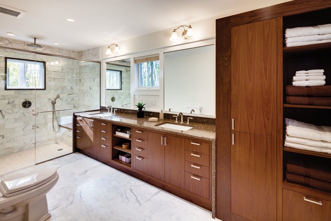
All the rooms’ cabinets are custom-designed by Phi, as in the owner’s bathroom, with its sleek walnut cabinetry and towel closets. The dark wood was picked to match the mahogany four-poster bed and dresser that the homeowner brought from an earlier house. Speckled brown Silestone (called Sierra Madre) wraps around the bathroom vanity and then continues as a seat and partial wall in the glass shower. Builder Rob Troxler says, “We wanted walnut in there, still to have it fairly modern but not stark and cold. We wanted something approachable, not so elegant that you feel you couldn’t use it.” Troxler’s words are almost like a mantra for the entire house.
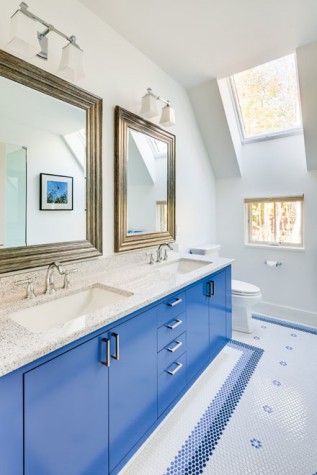
Although blue makes a frequent appearance—in the light blue medallion wallpaper of the powder room, the cobalt blue of the upstairs bathroom vanity, and the white and blue penny- round titles in the upstairs bathroom—the drapery and linens of the owner’s bedroom are purple and mauve to complement the dark mahogany furniture.
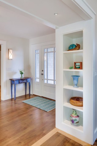
With plenty of built-in storage space, the house is spotless, in defiance of the clutter one associates with a small child. Beyond the obvious closets, there’s storage space under the long bench in the upstairs bedroom and in the knee walls of the loft. Built-in bookcases bracket the entry to the great room. Even the garage was designed extra deep to fit strollers and other equipment.
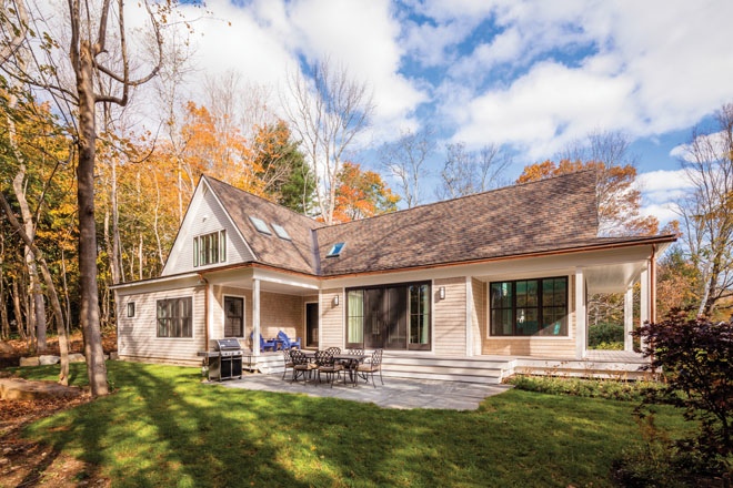
Grotton describes the exterior as an updated “take on a mill house.” To explain, he says, “Imagine a Cape-style house and turn it so the front is a gable end, and add half a story.” Of how the mill house then sits on the site, Troxler says, “There’s no grand façade. It’s more about nestling into the land.” Decks surround the house, and the deep porch overhangs allow for solar gains in the winter and solar shading in the summer. The roofs are steeply pitched to shed snow. They are covered with a triple layer of variegated asphalt shingles. The lower part of the house is finished with pre-dipped cedar shingles that will weather over time, and the upper part is finished with cement siding that looks like traditional clapboard.
For some reason, “happy” is the word that recurs when you talk to the contributors to the house. Van der Kieft remembers showing the homeowner a fabric and noting, “She immediately went to that, and that was my guideline. To make her happy.” Presumably a home-design team always wants to make a client happy, but with this project, the emotion seems bound up with the client’s being. Noting what a beautiful smile the homeowner has, van der Kieft concludes of the final product, “It’s just her. It’s a happy house.”

