Recharging Station
A renovation transforms a Camden home into an ideal personal sanctuary for its owner
February, 2020 | By: Jorge S. Arango | Photography: Francois Gagne
Ask any great leader, and they’ll tell you that an inescapable prerequisite for success is taking time to unplug from the chaos of contemporary life. The owner of this home on Camden’s harbor, a hard-charging professional woman who owns her own thriving business, understands the need for replenishment. And no location has ever been more central to that process for her than her home. “I was living in Camden with a view of the harbor,” she says, “but it didn’t have that ‘safe haven’ feel I wanted. As soon as I walked into this house, I knew it was the one. It was just a little bit outside of town, and it had western views, which I love because I love sunsets. Yet it still had the water too.”
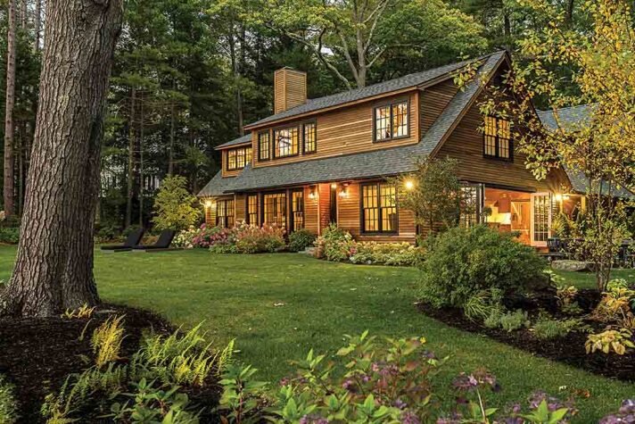
Before the home could press her reset button, however, some alterations were in order. While the exterior was mostly fine, recalls architect Chris Grotton of Phi Builders and Architects, the inside didn’t exactly telegraph a sense of sanctuary. “Everyone appreciated the way the house sat on the site,” he recalls. “It didn’t overwhelm or overpower it. We just had to find more opportunities to make better use of the spaces inside.” Still, some exterior modifications were needed—namely the replacement of doghouse dormers with shed dormers on the second floor. “This opened up headspace inside and provided more views of the water,” he explains.
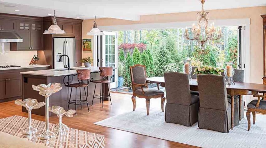
Grotton also added a patio on one side of the house and widened the aperture of the kitchen and dining-area window with accordion French doors that open 16 feet across onto the outdoors. “Because it was an existing structure close to the water,” continues Grotton, “we weren’t allowed to add any more area to the harbor side, so we placed the patio to the left of the house, which also let us take advantage of access to the kitchen for outdoor entertaining.”
Inside, says the owner, “The first thing was whether there was a way of getting the staircase out of the middle of the house. It chewed up square footage and also blocked the view of the water.” The stairs’ effect on the upper floor was particularly infelicitous. “You came up to the landing,” recalls Grotton, “at which point you had to turn right or left” into a series of chopped-up rooms on either side. By moving the staircase to the back of the house and consolidating the rabbit’s warren of tiny spaces on the second floor, he adds, “We actually made the upstairs room a much larger, unbroken space.” Ditto downstairs, where living room, dining room, and kitchen were originally independent, discrete spaces. “We were able to open it up into a more flowing open concept,” he says.
All of this, of course, necessitated a complete gut, during which Grotton worked with structural engineers at Camden-based Gartley and Dorsky “on the fly” to address surprises revealed by the sledgehammers. “None of the finishes that were there remain,” says Grotton, explaining how thoroughly the interior was reimagined for the client.
The choice of new finishes lay in the hands of Marcy van der Kieft of Margo Moore Interiors. The decorator had collaborated with the owner on several previous projects, and the women had a close enough relationship that they practically could finish each other’s sentences. The owner wanted to reuse all her furnishings from the previous house. “She doesn’t eliminate things,” says van der Kieft. “When she feels comfortable with something, she likes to stick with it.” However, the owner felt it was time for a completely different aesthetic and feel. The previous residence had sported dark floors and a palette dominated by purples and lavenders. It had also been much fancier. “I didn’t want to worry about coming out of the kitchen with slightly greasy hands and staining the satin on the dining room chairs,” she says. “I didn’t want it to look precious.” Also, she adds, “This is not a place I roll into from May through October, so I wanted it to feel warm year-round.”
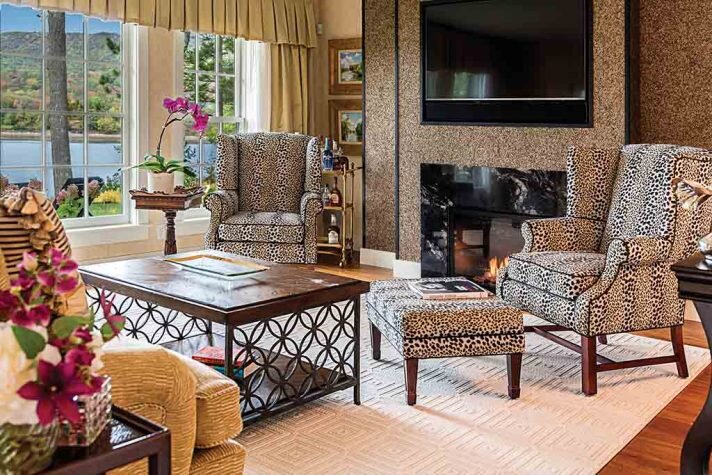
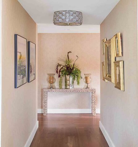
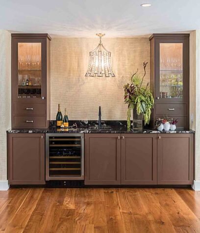
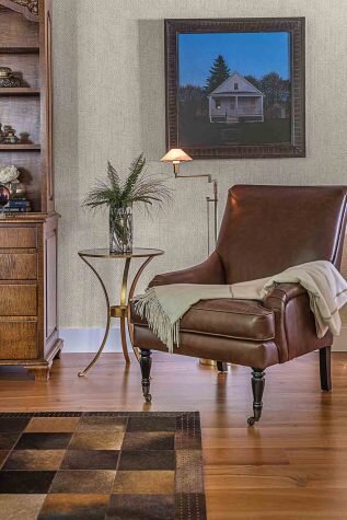
The women settled on more earthy tones inspired initially by a leopard-print rug the owner saw in a magazine. “She wanted some exotic feel,” remembers van der Kieft, who reupholstered wing chairs in a pattern resembling the coat of a snow leopard and also gave her client a zebra hide–covered ottoman. “But when it came right down to it, her main concern was comfort. We felt the best way to achieve that was with more texture. Just the Maya Romanoff wallpaper on the fireplace surround, which looks and feels like pebbles, shows you what you can do.” She also wrapped most of the downstairs in a Phillip Jeffries grasscloth, instantly eliciting an embracing warmth. “It added dimension to the walls,” she notes.
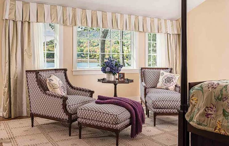
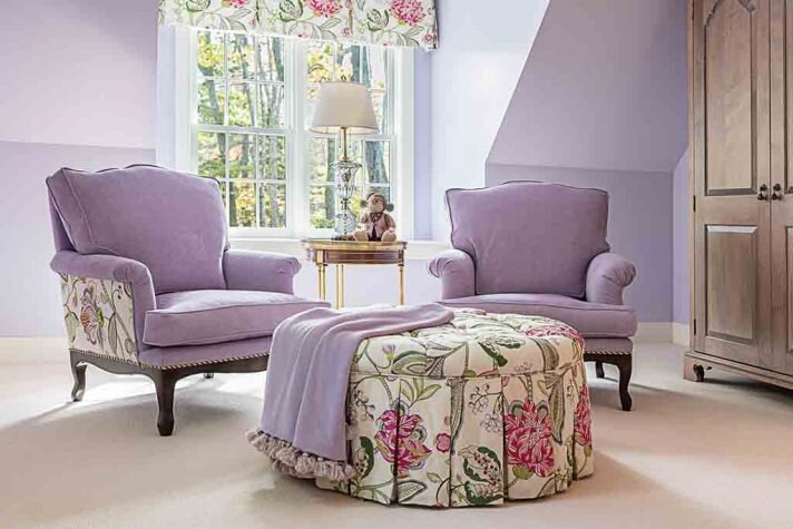
Some lavender made the journey from old house to new, mostly in a second-floor guest room. And there are purplish touches in the owner’s bedroom as well. (Technically the 4,250-square-foot home has four bedrooms plus a separate guest cottage, but the owner uses one of them as an office and another as a gym.) Otherwise, however, the two environments bear little resemblance to each other. The floors, rather than ebonized, are rustic North American cherry. Those satin dining chairs were recovered with a dark, nubby textured fabric. The kitchen, in keeping with the house, is more contemporary, sporting large-format glass tiles on the backsplash.
Though eminently comfortable, the public spaces have subtle glamorous touches that bring relaxed sophistication to the overall sense of informality. Over the dining room table, for instance, is a crystal chandelier, and, says van der Kieft, “We threw in some gold in the draperies to give the living room and dining room some bounce.”
Throughout, the homeowner remained very involved in the process, which was fine with van der Kieft. “I can dictate anything to anybody,” she says, “but it’s not my favorite way of doing things. I feel this home is really for her; a place she retreats to. She’s taken what could have been an ordinary home and made it very warm. It’s sophisticated, but also very comfortable.” Thanks to the talented design team, the owner is now able to come home and sink into the sense of “safe haven” she craved.
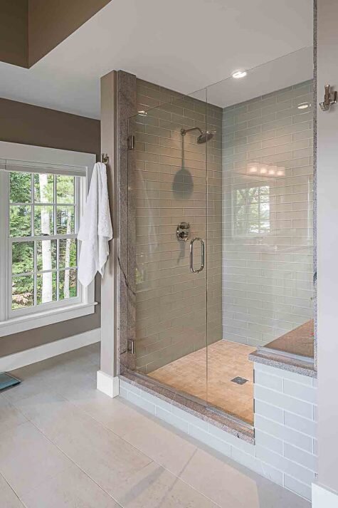
The generously proportioned shower showcases more glass tile, as well as a built- in bench.
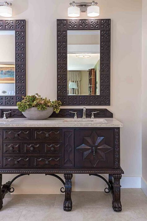
In the owner’s bath, an intricately carved claw-foot sideboard, found by the owner and retrofitted with double sinks, provides more character than the expected built-in bath vanity. Carved mirrors enhance the look.
Resources
OTHER RESOURCES
Bayview Painting
Atlas Homewares
Lauriermax
Fusion Audio Video
Simpson Door Company
Morningstar Stone & Tile
Bosch
Gartley & Dorsky Engineering Surveying
Dan Eaton Landscape Services
Phi Builders + Architects
Distinctive Tile + Design
Viking Lumber
Smith & May Masonry, Inc.
Horch Roofing
Achorn’s Electric
A.E. Sampson & Son

